GCRS
my contributions
user experience design
user experience research report
GCRS is a specialist organisation providing regulatory and compliance services to businesses looking to promote a product.
Thrilled by the opportunity presented by Connexion Technology, I thoroughly researched their entire website, meticulously identified and evaluated pain points, and skillfully crafted a visually stunning presentation that showcases delightful design solutions.
/ 01
findings
/ purpose of the research
Emphasizing the specific UX aspects that are lacking or need improvement
Finding 1
The website lacks clear indications of system status, such as loading indicators or progress bars. Users may be left uncertain about the progress of their actions or the loading of content.
Severity: 2/4
Heuristic Violated: Visibility of system status
Recommendation Add loaders/progress indicators on each page to indicate ongoing processes and improve user understanding.
Finding 2
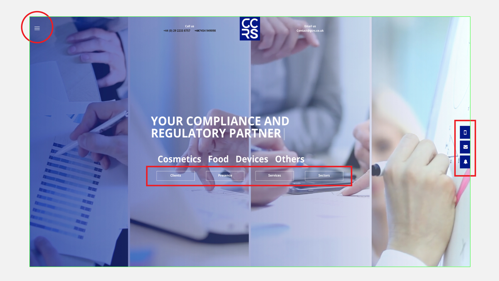
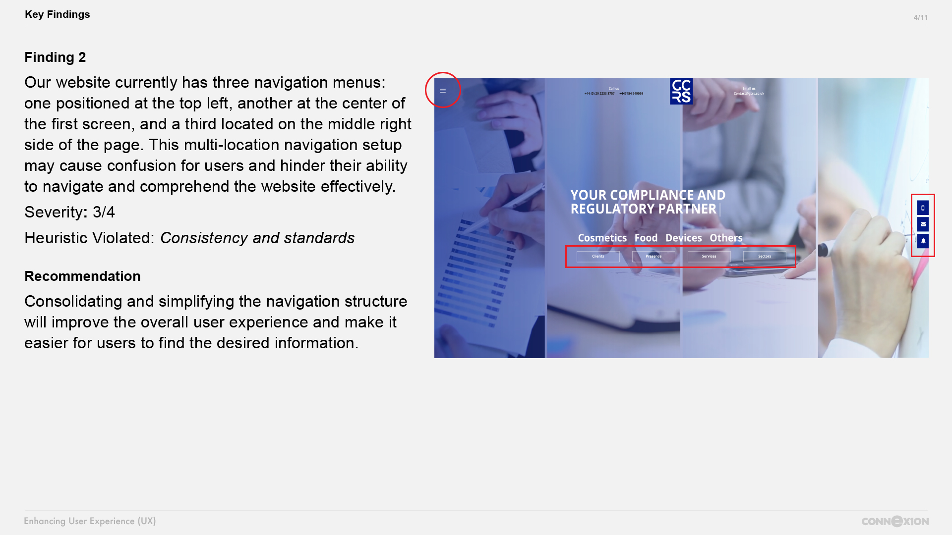
Our website currently has three navigation menus: one positioned at the top left, another at the center of the first screen, and a third located on the middle right side of the page. This multi-location navigation setup may cause confusion for users and hinder their ability to navigate and comprehend the website effectively.
Severity: 3/4
Heuristic Violated: Consistency and standards
Recommendation Consolidating and simplifying the navigation structure will improve the overall user experience and make it easier for users to find the desired information.
Finding 3
While scrolling down on each page, the next contents appear to flicker, creating a perception of uncertainty for the user. This unintended flickering effect may lead users to question if there is a problem with the website or if the content is loading correctly.
Severity: 2/4
Heuristic Violated: Visibility of system status
Recommendation Addressing this issue and ensuring smooth transitions between sections will enhance the user experience by providing a more seamless and visually stable browsing experience.
Finding 4
The overlapping text makes it difficult for users to read and comprehend the information presented, affecting their understanding of the system's status or the content being displayed.
Severity: 2/4
Heuristic Violated: Visibility of system status
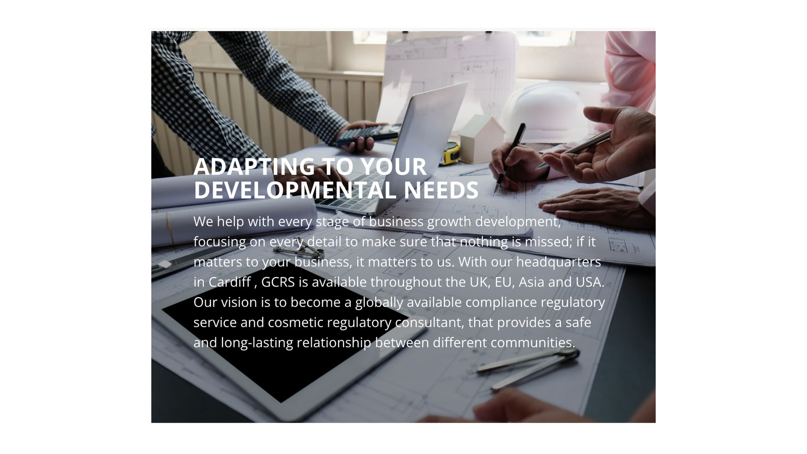
Recommendation By repositioning the text to ensure it is clearly visible and legible, we can enhance the user experience by providing perceptible information and improving the overall readability and clarity of the website.
Finding 5
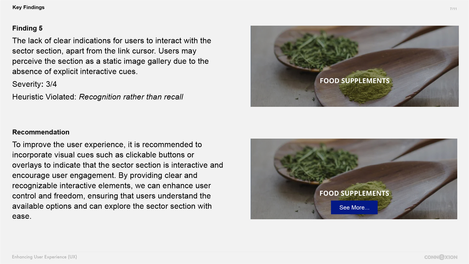
The lack of clear indications for users to interact with the sector section, apart from the link cursor. Users may perceive the section as a static image gallery due to the absence of explicit interactive cues.
Severity: 3/4
Heuristic Violated: Recognition rather than recall

Recommendation To improve the user experience, it is recommended to incorporate visual cues such as clickable buttons or overlays to indicate that the sector section is interactive and encourage user engagement. By providing clear and recognizable interactive elements, we can enhance user control and freedom, ensuring that users understand the available options and can explore the sector section with ease.

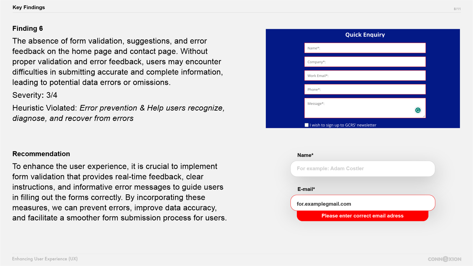
Finding 6
The absence of form validation, suggestions, and error feedback on the home page and contact page. Without proper validation and error feedback, users may encounter difficulties in submitting accurate and complete information, leading to potential data errors or omissions.
Severity: 3/4
Heuristic Violated: Error prevention & Help users recognize, diagnose, and recover from errors
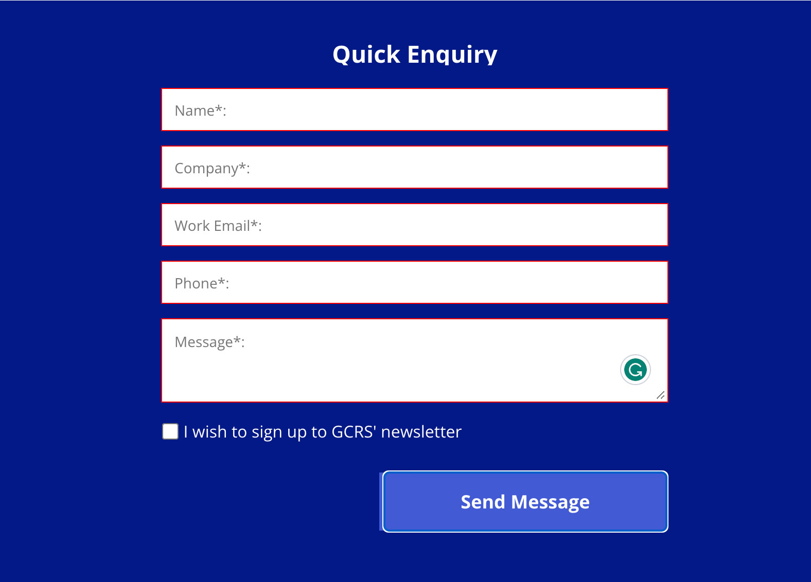
Recommendation To enhance the user experience, it is crucial to implement form validation that provides real-time feedback, clear instructions, and informative error messages to guide users in filling out the forms correctly. By incorporating these measures, we can prevent errors, improve data accuracy, and facilitate a smoother form submission process for users.

/ 02
other findings
/ The following findings are essential considerations for enhancing the overall user experience
- The presence of background colors behind some logos in the association section disrupts the minimalist design.
Removing or standardizing the background treatment will create a visually cohesive and professional experience for users. - The world map at the bottom of the page is cut off on the right side, which negatively impacts the visual presentation.
Resolving this issue by adjusting the map's size or layout will ensure the complete visibility of the map and maintain the intended design integrity for a better user experience. - The social media section is not properly laid out, occupying excessive space on the page.
Optimizing the layout will help achieve a more balanced and efficient use of the page, improving the overall user experience. - The child pages of the website currently lack a footer section, which results in an inconsistent user experience and a potential loss of valuable information and navigation options.
The absence of a footer section deprives users of essential links, such as contact information, site navigation, privacy policy, terms of service, and other relevant content that is typically found in the footer.
/ 03
presentation design


/ 04
conclusion
In conclusion, the evaluation process of the website https://www.gcrs.co.uk has revealed several areas for improvement from a UX perspective. By addressing these findings and implementing recommended enhancements, we can significantly enhance the overall user experience and usability of the website.
Key areas identified for improvement include simplifying the navigation structure, improving readability, optimizing loading speed, incorporating visual cues, implementing form validation, ensuring clear indications of interactivity, and addressing content overlaps and missing elements. By addressing these issues, we aim to create a user-friendly, visually appealing, and intuitive website that meets the needs and expectations of the target audience.